An ongoing semester long branding project for my Advanced Graphics Class at Indiana Wesleyan University completed in the Fall of 2014. We worked in design teams and each team worked to create new branding for a non-profit organization in our university town of Marion, IN including a new logo, stationery pieces, business cards, and additional materials that we felt would complement the brand experience. Our team chose the Marion Public Library.
Note: These designs were not actually implemented and only created for educational and practice purposes.
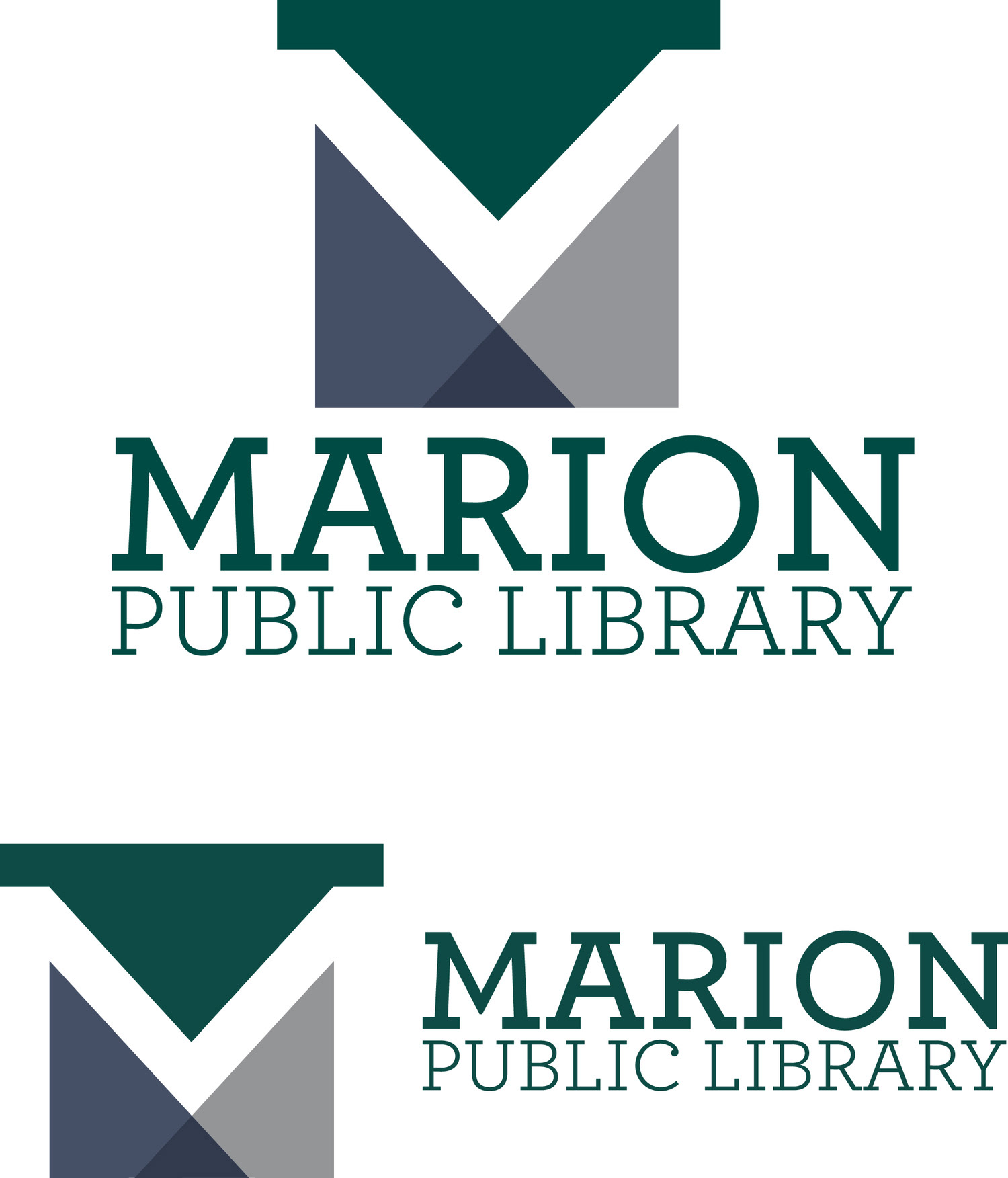
Color Logos
The library needed a fresh and updated look as well as for their brand to be built on community, collaboration, and connection and the fact that libraries nowadays are "more than just books." The library in Marion is also historical and has been an important part of the community since the late 1800's and we wanted to try and preserve that historical aspect. We decided to go of more of the abstract route with our logo.
We chose triangles as our base shapes to represent stability and the fact that the library has been a stable and constant institution in the community and will continue to be.
We made the two right angle triangles converge to create the smaller triangle at the bottom of the logo to represent community, collaboration, and connection coming together which is the vision of the library.
Finally we added the shape on top in order to create the hidden "M" in the white space of the logo, because there is more to the Library than meets the eye and sometimes you really have to look and see all that the library has to offer. The M also mimics the M of the font we chose.
These are the fiinal logos in color in two different orientations to be implemented for different uses.
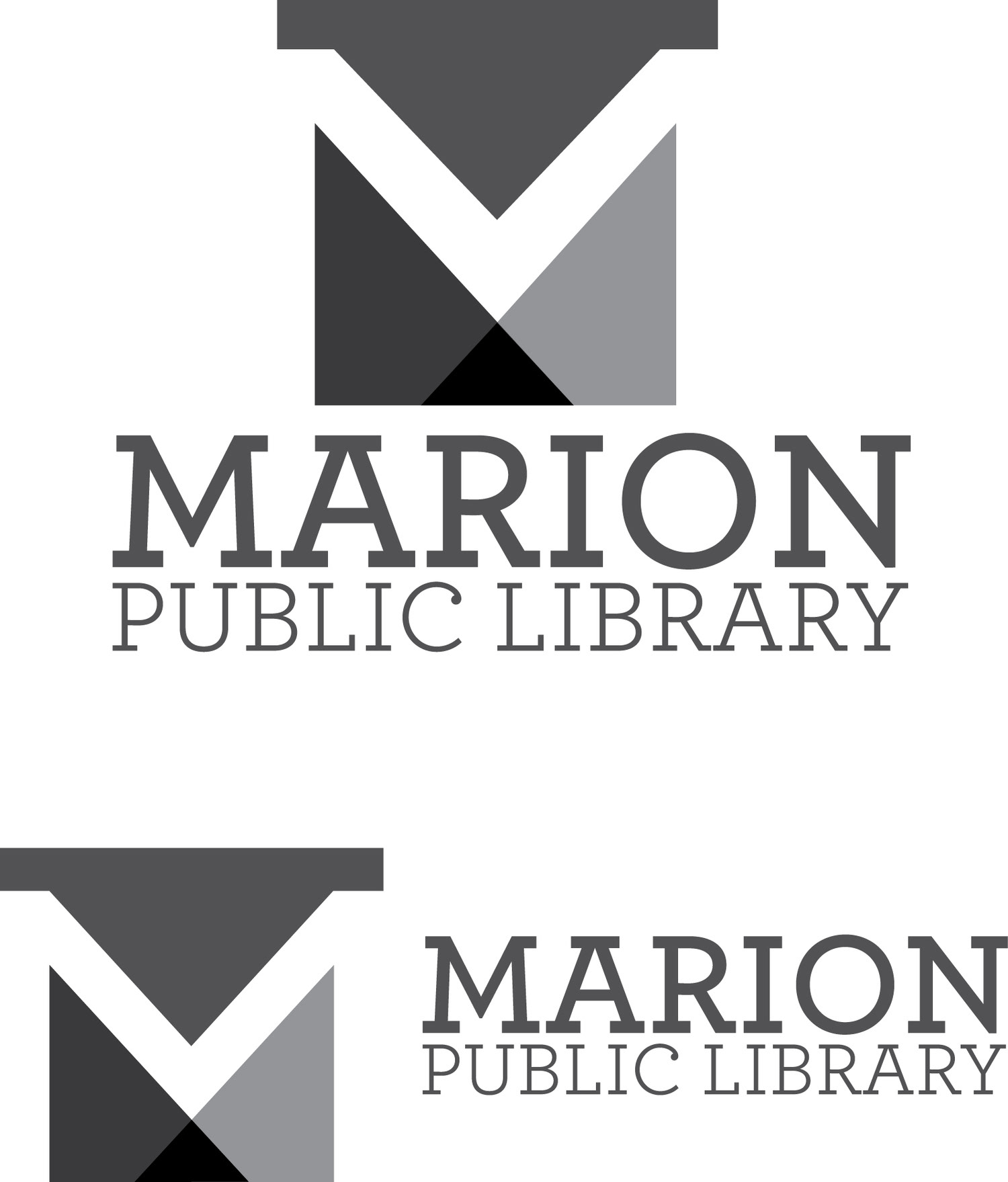
Grayscale Logos
Final logos in grayscale in two different orientations to be implemented for different purposes
Final logos in grayscale in two different orientations to be implemented for different purposes

Color Palette
Color palette/color scheme used for the logo and our branding.
Much like the library itself, this color palette is simple, distinguished, and refreshing. The palette stays true to the original logo’s use of the dark green, but is paired with some cool blues and two warmer grays that we felt would complement the dark green color.
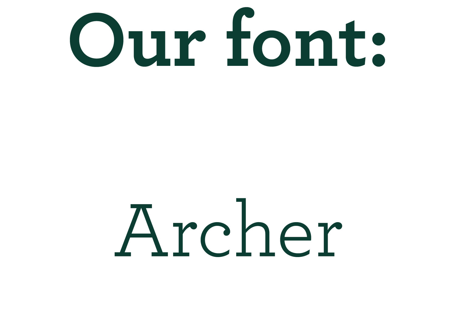
Our font used
“To make the typeface frank — direct, but not brusque — we introduced subtle cues from the world of typewriter faces, which combine the ordinariness of Antiques with the mod- ern practicality of Geometrics. We restored the vanished ‘ball terminals’ to the lowercase, and uncharacteristically applied these gestures to the capitals as well, in order to yield a font that’s friendly without being silly, and attrac- tive without being flashy. The result is a typeface that’s well-mannered, easy to work with, and inviting to read.”
“To make the typeface frank — direct, but not brusque — we introduced subtle cues from the world of typewriter faces, which combine the ordinariness of Antiques with the mod- ern practicality of Geometrics. We restored the vanished ‘ball terminals’ to the lowercase, and uncharacteristically applied these gestures to the capitals as well, in order to yield a font that’s friendly without being silly, and attrac- tive without being flashy. The result is a typeface that’s well-mannered, easy to work with, and inviting to read.”
- The Developers of Archer
Archer is a fresh take on typical serif fonts, which are traditionally printed for text in books. It’s an easy to read font with a sense of credibility. Marion is sized larger, placed on top of “public library”, and is set in a heavy weight in order to create heirachy and emphasize that it’s not just any library, but the Marion Public Library.
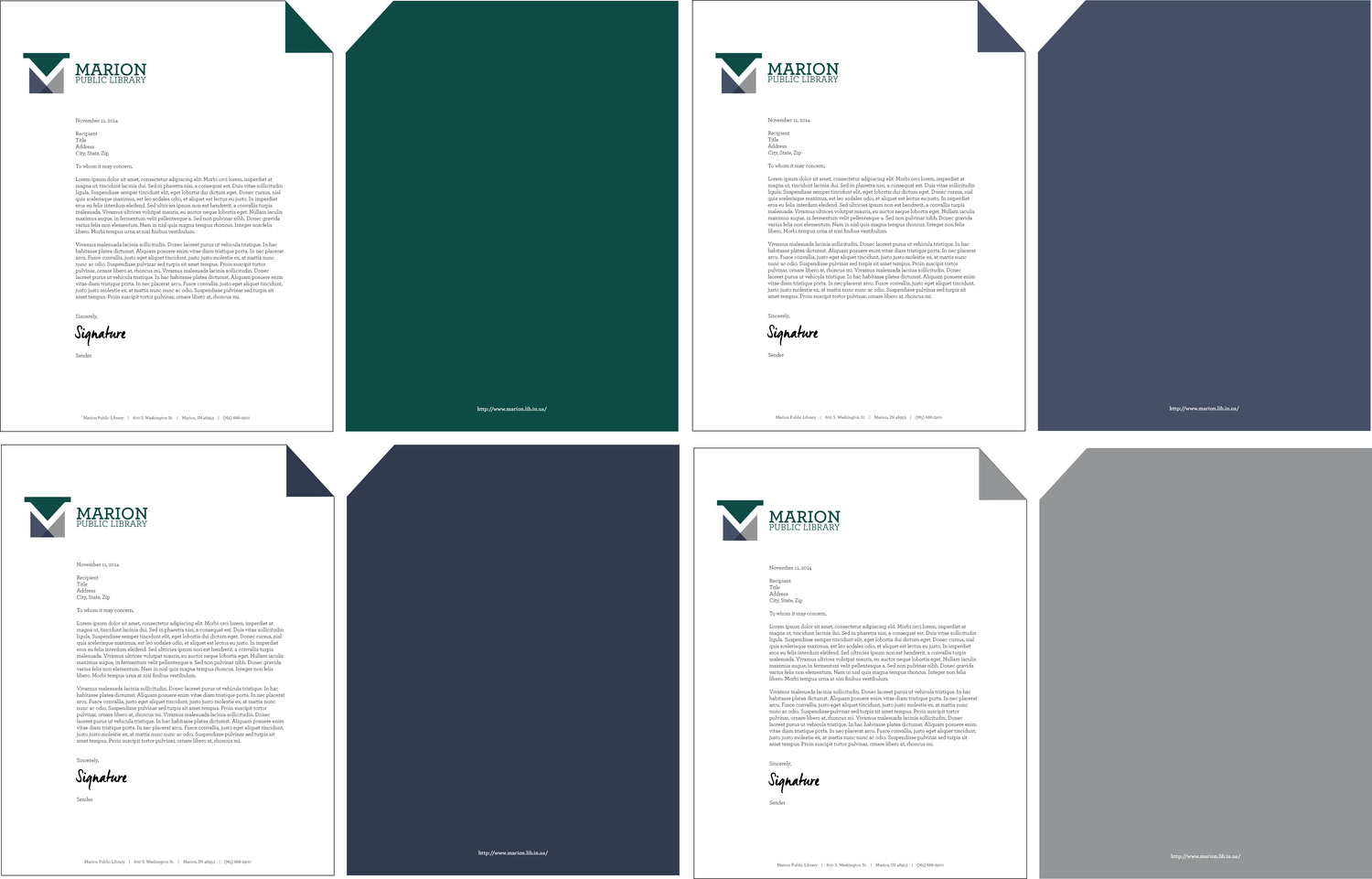
Letterhead
In this next phase, we created the stationery set that incorporates our new logo and brainstormed new ways to further develop our brand in this next set of artifacts.
In this next phase, we created the stationery set that incorporates our new logo and brainstormed new ways to further develop our brand in this next set of artifacts.
The first of the stationery set is the letterhead. We decided to incorporate one of the triangles from the logo to create a die cut on the upper right hand corner of the letterhead. We liked the idea that this gave the impression of "dog-earing" the pages of a book and we continued the color of the dog ear triangle to the back of each letterhead for a fresh and unique look. We utilized each of the colors from the logo. We figured it would be fun for employees to either choose their favorite color or use each color to represent a different department in the library.
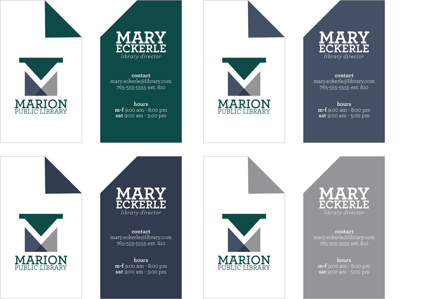
Business Cards
For the business cards, we decided to incorporate the dog-earing and use of the four logo colors further into the designs. Again, each color could either be chosen based on the preference to the employer or could have been distributed by department.
For the business cards, we decided to incorporate the dog-earing and use of the four logo colors further into the designs. Again, each color could either be chosen based on the preference to the employer or could have been distributed by department.
Library Card
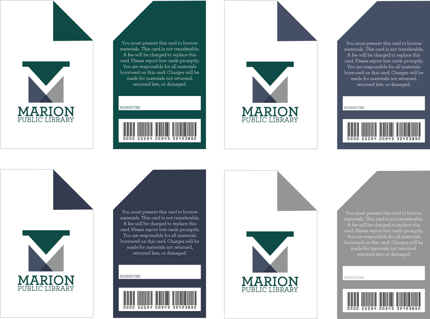
After the logo and stationery, we needed to further incorporate and implement our new brand into artifacts that the library could use. One of the ways we decided to do this was by creating new library cards that incorporated the dog eating and colors from the business cards and letterheads.
After the logo and stationery, we needed to further incorporate and implement our new brand into artifacts that the library could use. One of the ways we decided to do this was by creating new library cards that incorporated the dog eating and colors from the business cards and letterheads.

Library Key Cards
Library key cards to be included with the full library cards
Library key cards to be included with the full library cards